In 2023, after 15 years in business, Lara Jeanneret, owner and lead graphic designer of Lara J Designs decided it was time to introduce a fresh new logo to our clients. The original logo, which Lara designed when she opened the business in 2008, was still a good design. It was clean, informative, and inviting. And while it served the company well for many years, it did lack some versatility due to its layout, making it difficult to use in certain situations. The original logo was also more text-based, which can be a great option for many businesses. However, an icon to go with the logotype provides an opportunity to convey more detailed concepts and ideas. With a desire for something more adaptable and meaningful, Lara decided it was time for a new look, which would better reflect the priorities and goals of Lara J Designs in 2023 and in the future. This time, the redesign would be a team effort, ensuring that everyone at Lara J Designs felt a sense of ownership and pride in the final result.
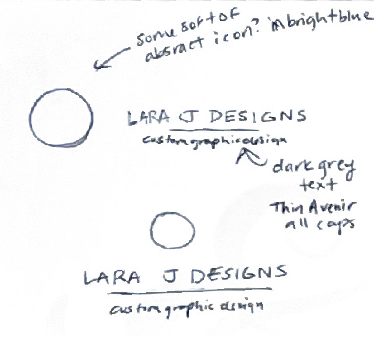
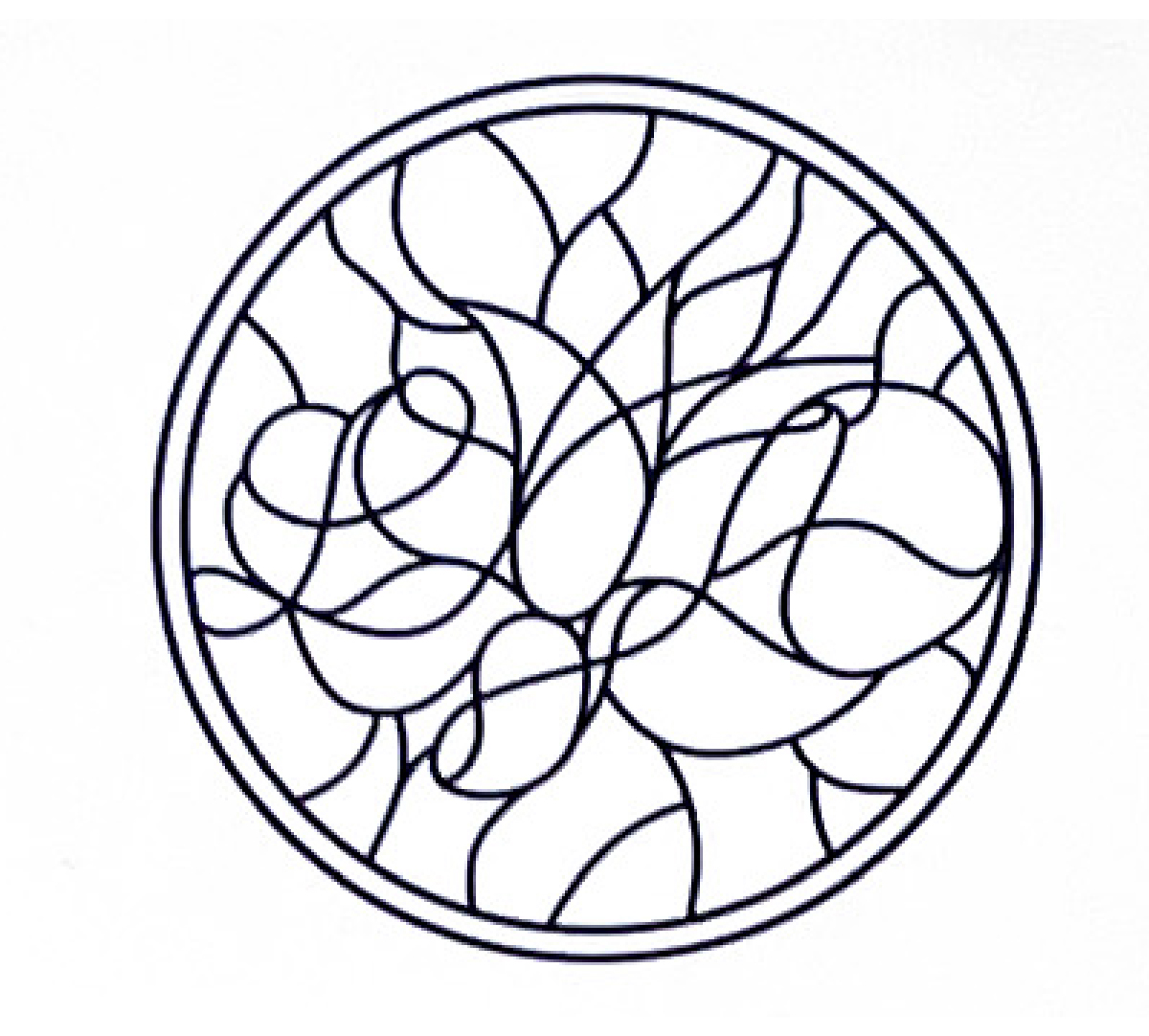
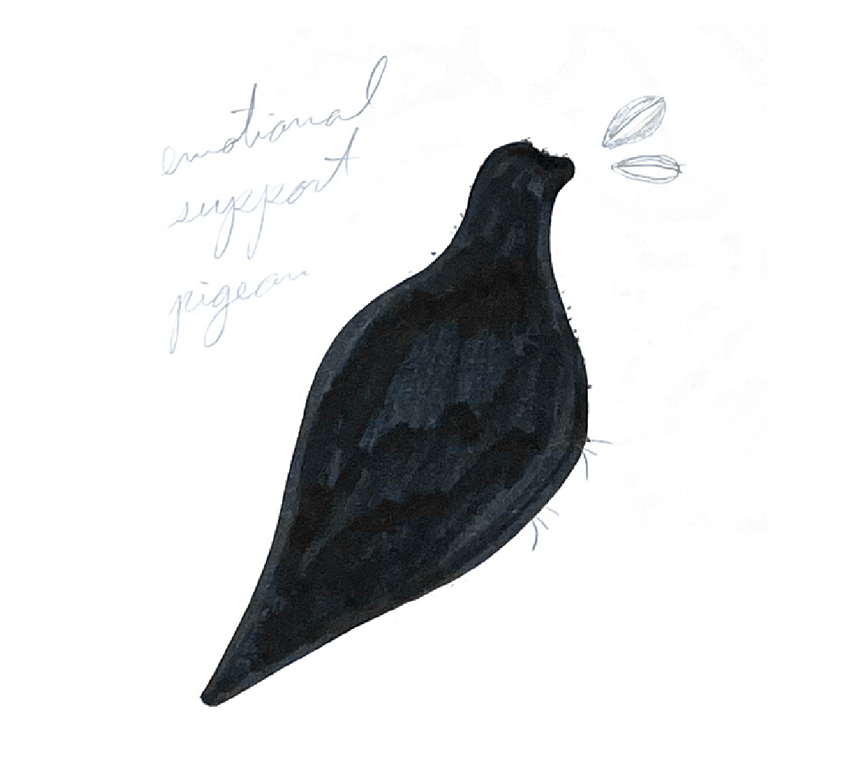
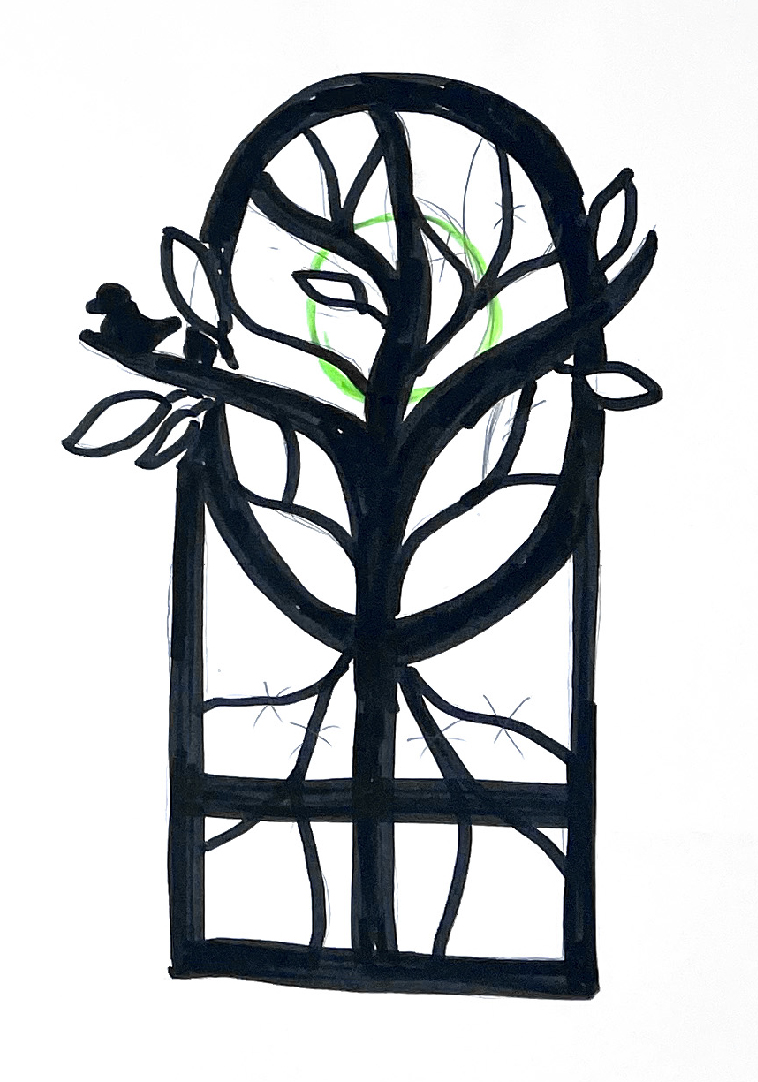
Team Sketches
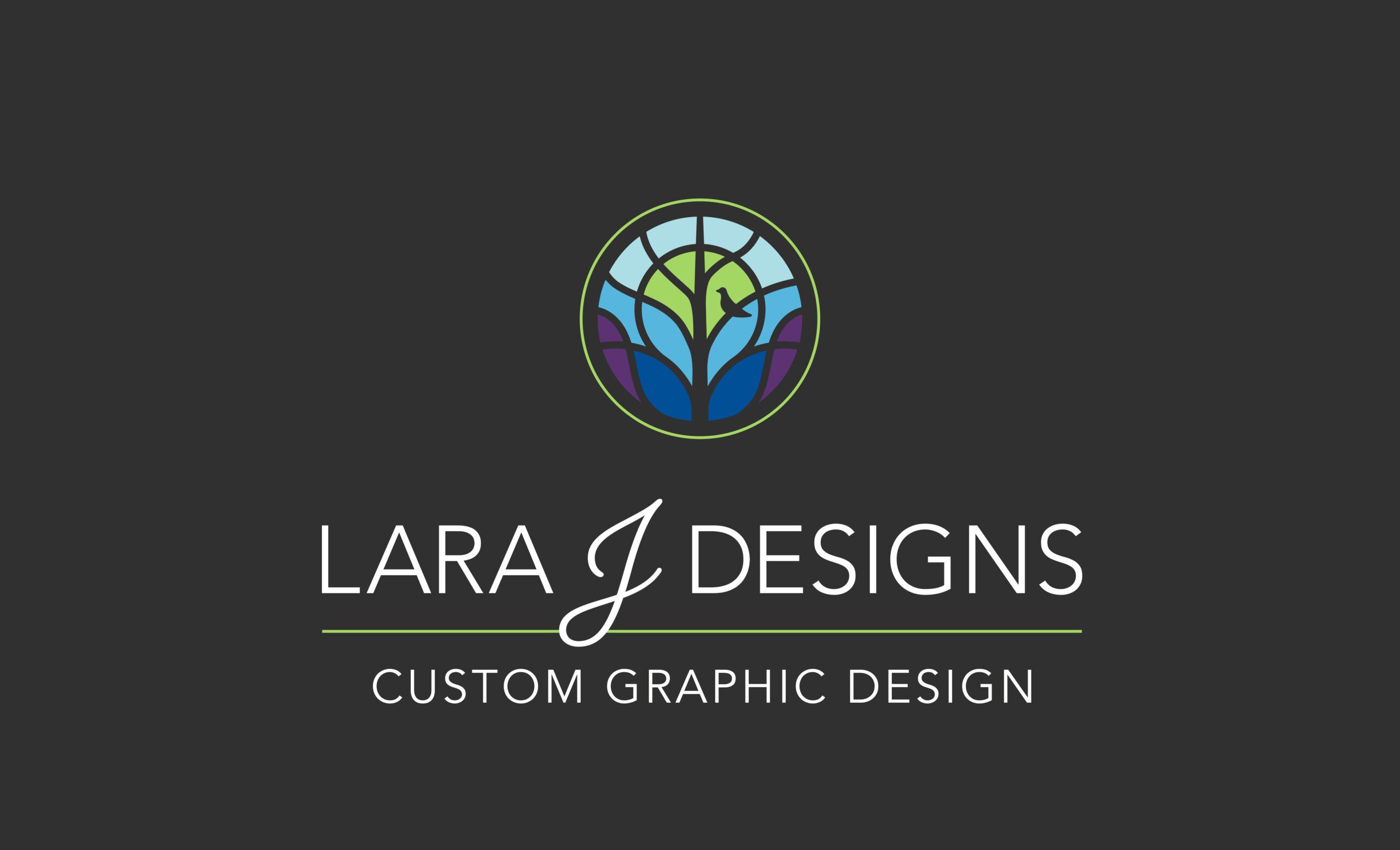
The new logo draws inspiration from the beauty of nature and its ability to self-organize within its ecosystem. It features a branching tree and a bird created with the use of negative space, which separate shades of blue, purple, and green. The tree symbolizes growth, which is a core value of Lara J Designs as a company. Just as trees grow both organically and geometrically, we aim to help our clients grow their businesses through design that balances creativity with professionalism. The bird represents freedom and accomplishment, perched on a branch as if gazing out over a wide landscape. The imagery invites viewers to look out over their future with a sense of hope and possibility. Together, the tree and bird reflect both the beauty of nature and the transformative power of thoughtful design.
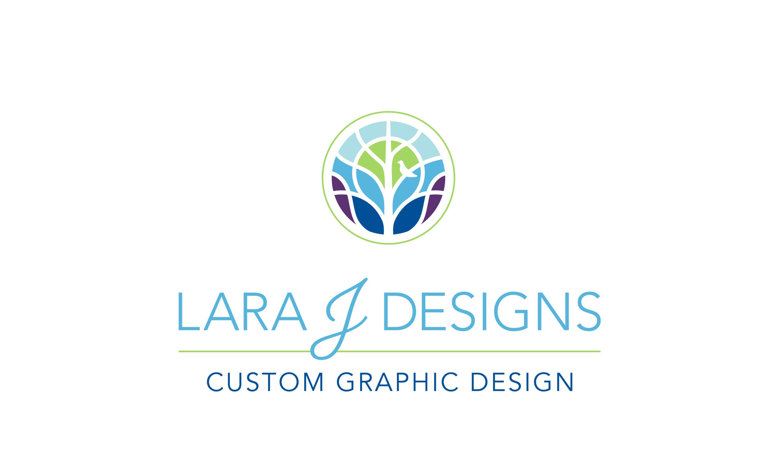
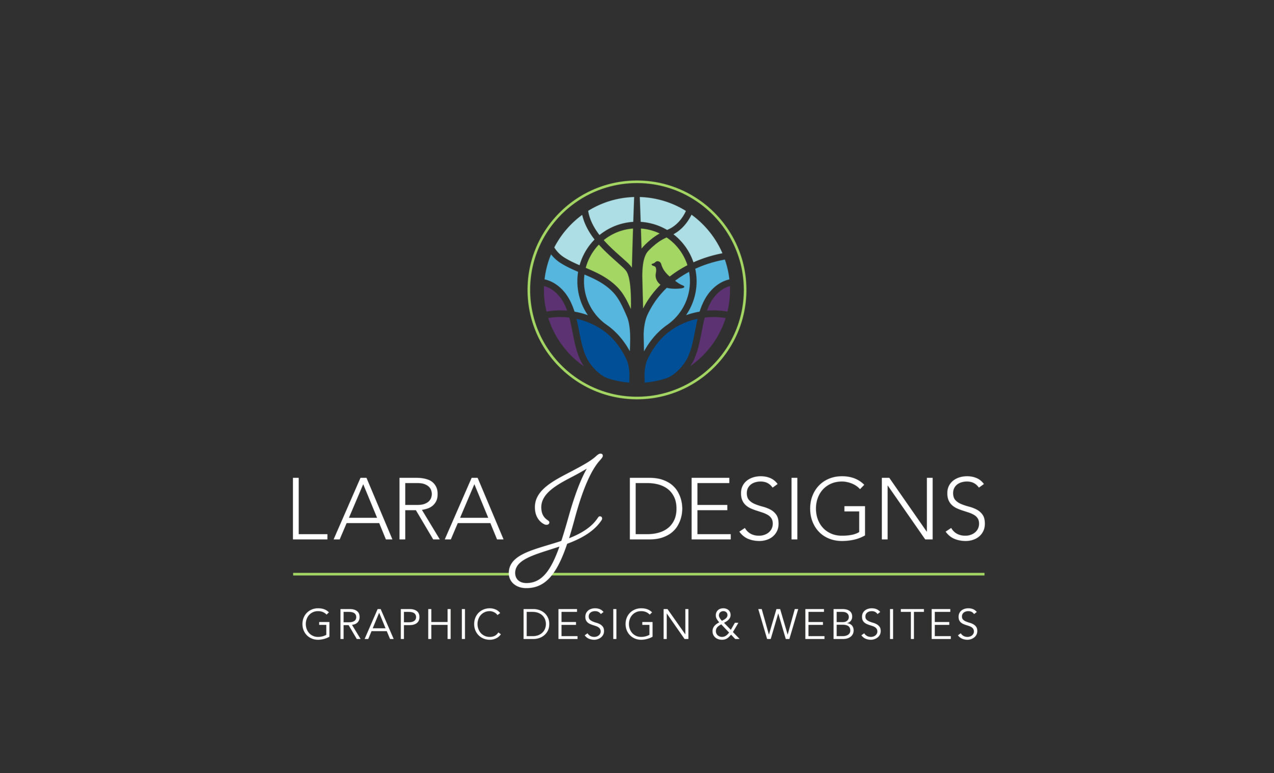
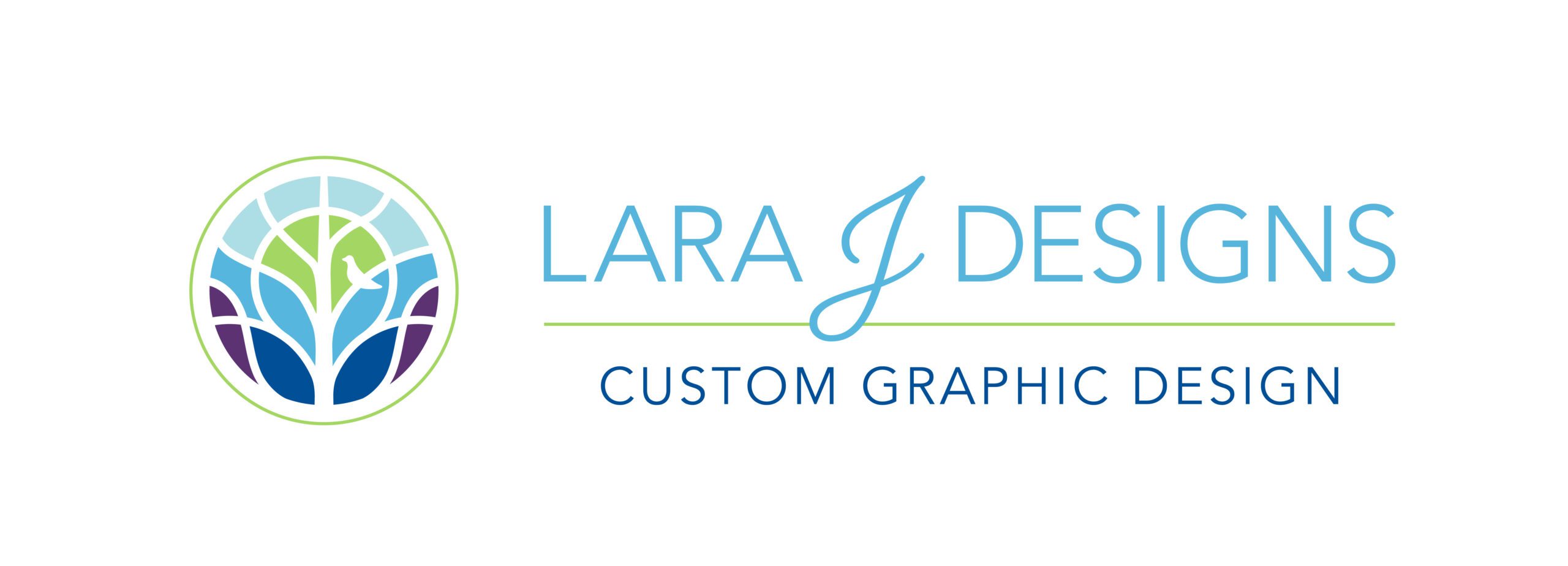
Final Logo Design with Variations
The design choices were also inspired by the timeless feel of stained glass windows found in historic buildings. While no specific window was emulated, the classic charm of stained glass resonates with the company’s Historic Downtown Cartersville roots. The colors were carefully chosen to create a sense of richness and optimism, starting with deep purple and dark blue at the base of the tree and lightening to pale blue at the top. This gradient effect symbolizes a journey from grounded beginnings to the bright possibilities of the future. The use of white space between colors gives the logo a clean, modern look while keeping it warm and approachable.
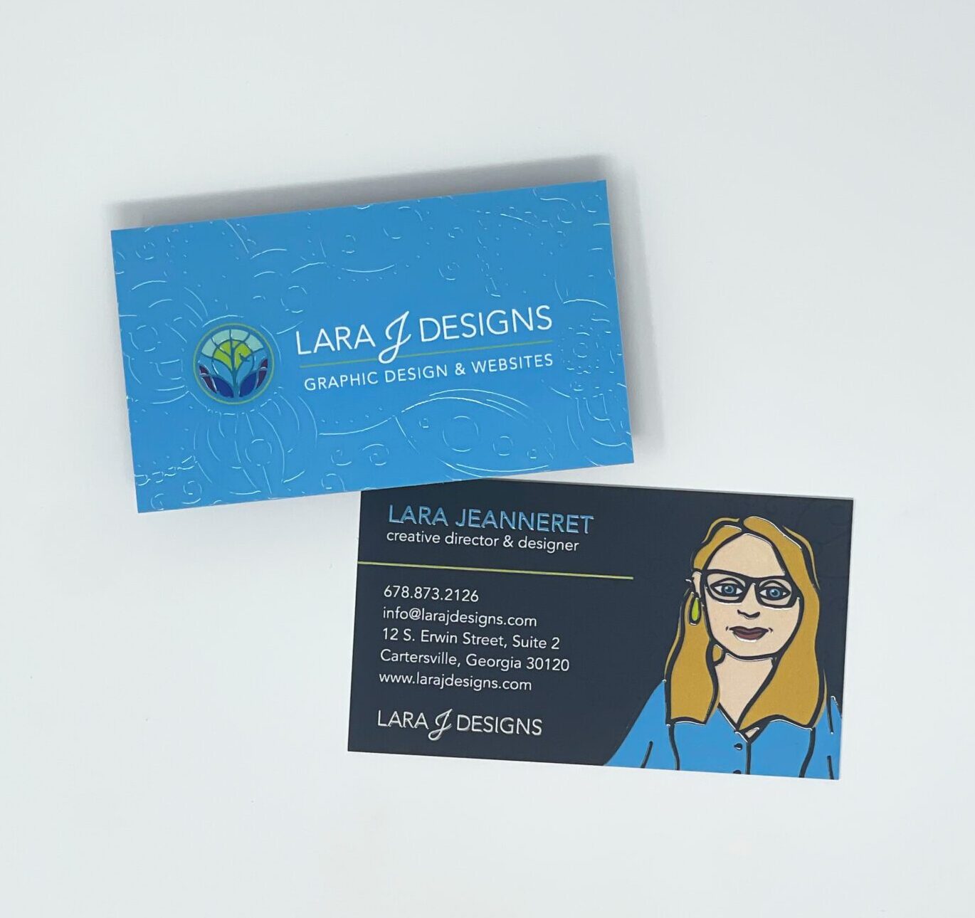
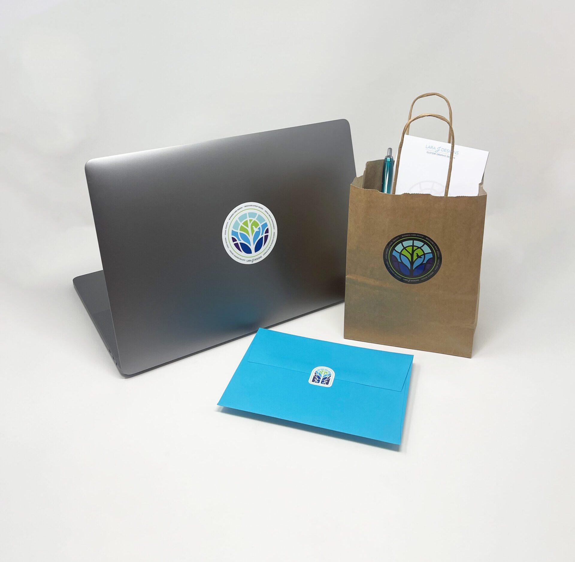
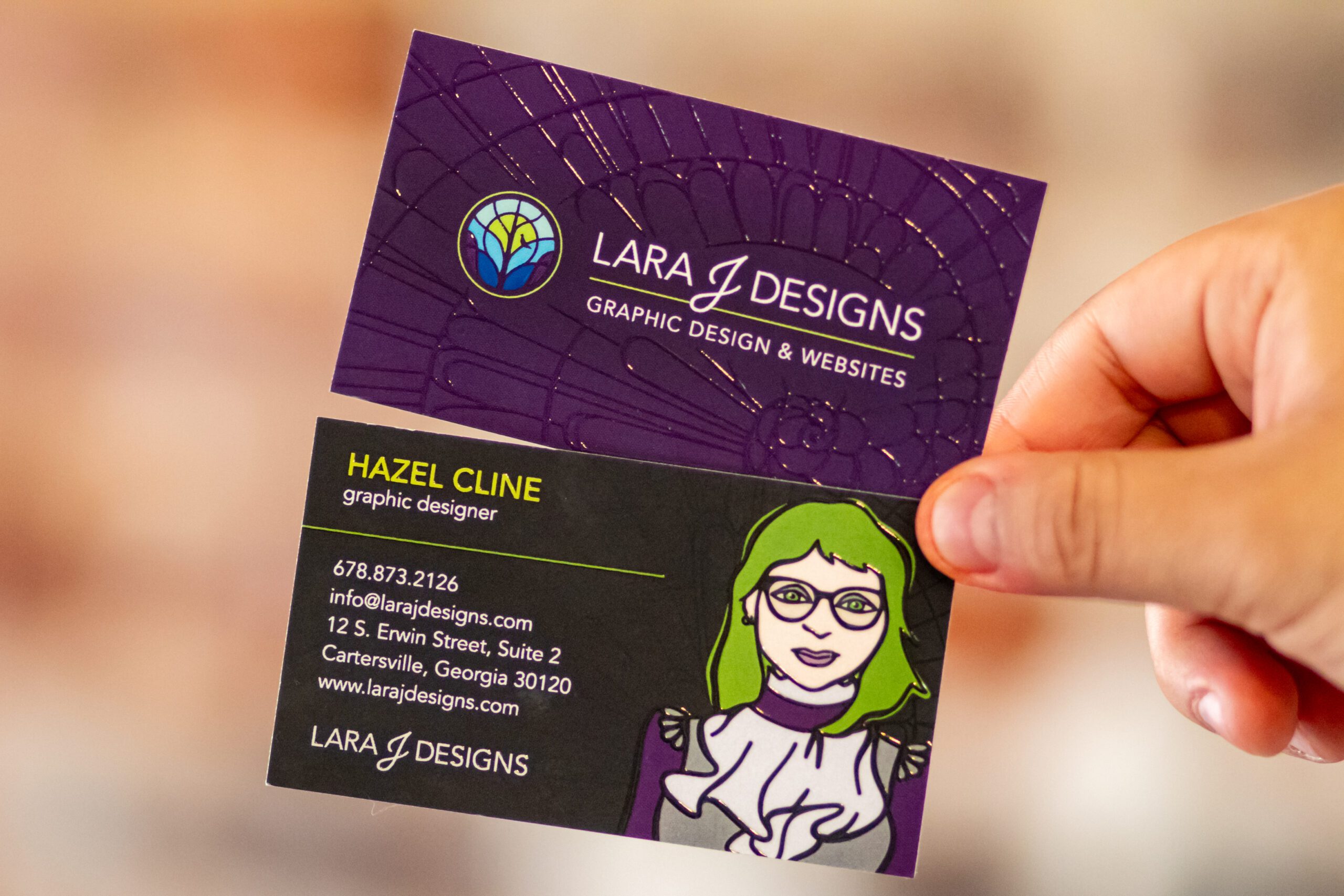
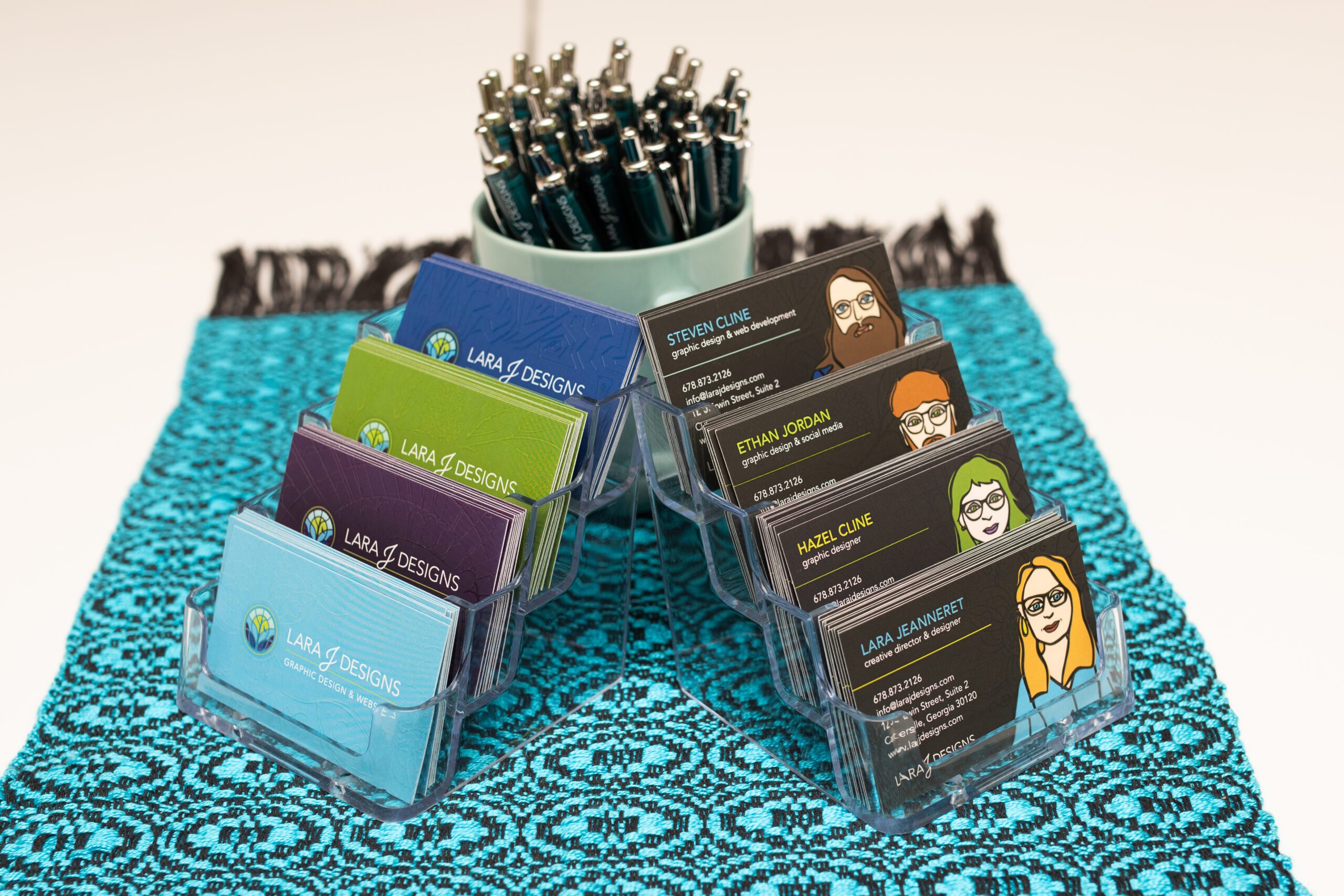
One of the key goals of the redesign was to create a versatile logo that could adapt to various uses. The new logo includes multiple variations: a wide version with the icon to the left of the text, a stacked version with the icon above the text, and two standalone icons — one round and one window-shaped. The hidden “L” in the window icon adds a playful, personal touch that speaks to our attention to detail. These variations ensure that the logo works beautifully across formats, from business cards to billboards. Each version is also available in white to stand out on darker backgrounds, making the new logo as practical as it is meaningful.
Ways we’ve used our new logo
At Lara J Designs, we believe that thoughtful design helps businesses grow and thrive. Our new logo reflects both our roots and our aspirations, balancing tradition with innovation. Just as the tree grows stronger over time, we look forward to growing alongside our clients and community in the years to come.

