October 22, 2015
by Casi Cline, graphic designer & illustrator at Lara J Designs
Color is one of the most important tools utilized by Graphic Designers to convey the client’s intended message. For the last few years, color trends in graphic design have been heavily inspired by simple but striking designs from the mid-20th century. This revival of simple, flat design is in part a reaction against the garish and messy design trends of the nineties and early two thousands. With simple design, color choice becomes even more essential to balance a clean look while still providing interest. Though retro styles have been utilized for a long time, recent color palettes go beyond simple nostalgia, using key elements of retro design such as bold colors, color blocks, and simple color palettes as a jumping off point to create startling and impactful juxtapositions and bold imagery. Retro elements of color have combined with distinctly clean and modern elements in a way that is straightforward, professional, and inviting. We will examine recent color trends in terms of the kinds of colors used and color combinations.
a reaction against the garish and messy design trends of the nineties and early two thousands
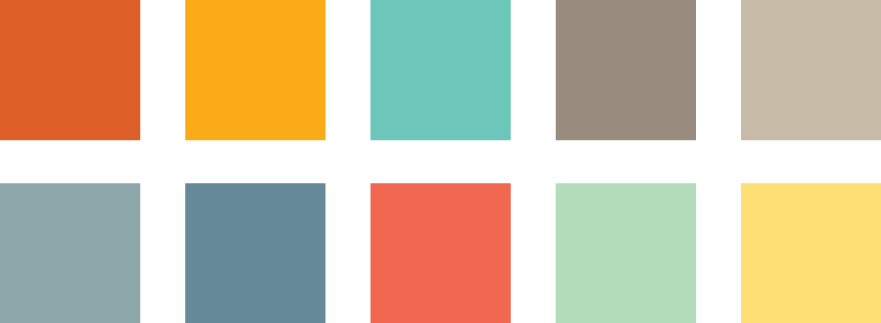
The kinds of colors used in recent years are often much more toned down than those used in the past. Instead of pure primary colors, you will see a lot of secondary colors or grayed down colors. Recent color palettes are more likely to feature colors such as turquoise, mint, salmon, or periwinkle than blue, green, red, or purple. Neutrals have become very important. Although warmer neutrals are sometimes included in recent color palettes, gray, in particular, has become the neutral of choice. Gray is gender neutral, professional, calming, and can be used with almost any color. The following color palette includes some of the key colors in modern design.
Recent color combination trends are often unexpected and striking. An important example would be using a predominately gray color palette with little splashes of a bright color such as orange, teal, or yellow. Another color combination trend is an increased emphasis on pairing complimentary colors, which is in itself nothing new. However, in addition to the traditional red/green, blue/orange, purple/yellow, recent trends include more secondary colors or tones such as turquoise/red-orange or salmon/mint, which are bright without looking childish or generic.
Recent color combination trends are often unexpected and striking.
These recent color trends may have evolved partially from retro styles or as a reaction against previous trends, but they have evolved further into a supremely modern style that is striking, eloquent, and tasteful.
Contact Lara J Designs for more information about how we can help you utilize the best possible colors for your marketing.
 |
 |
 |
 |

