Many new website design trends have emerged over the past few years. In this article I will briefly go over a few of the most important ones that have gotten our attention.
Full Width Elements
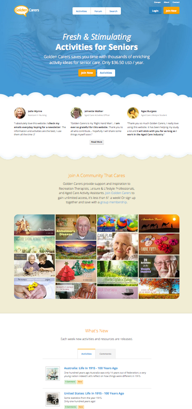
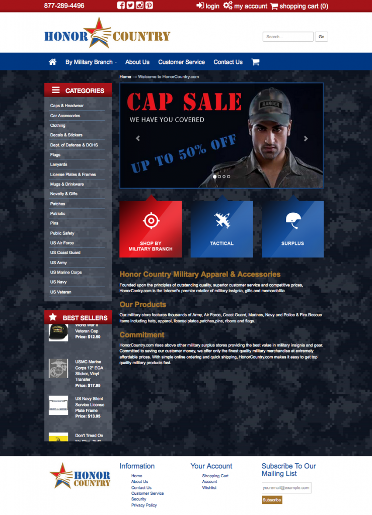
Now that responsive design is the norm, many websites have been moving towards incorporating full width elements. Large full width slideshows and color backgrounds are a great way to add interest to elements on the page.
The Long Scroll
The single page “Long Scroll” has been been popular in web design for a little while now. The results can often look stunning, but from the standpoint of SEO it can be detrimental and often gives the feeling of information overload. Definitely not a one size fits all approach. The jury’s still out on this one…
The Icon Homepage
Many websites have been leaving behind or cutting down the intro paragraph for the home page, instead opting for three or four section boxes with large icons. For those of us more visually oriented, this is a good way to quickly get across information about services or the sections of a website. In a similar vein – many websites use also photography sections to the same effect.
White Text Over Large Image
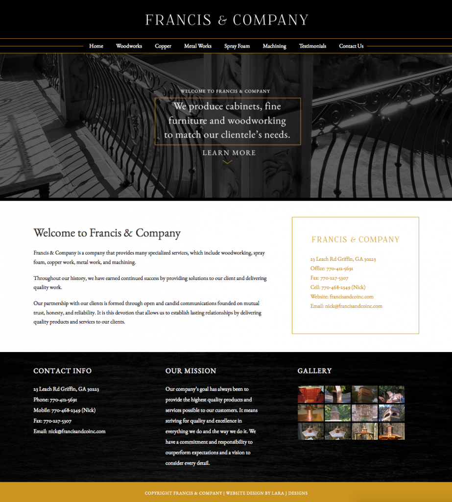
This approach is very widely used in recent web design. Usually a large image or slideshow dominates the portion of the website which is “above the fold”, and white intro text overlays the image. Sometimes white buttons are also used, for a quick link to important content.
Need to give your website a fresh look?
We can help you with a website redesign. Please call or email us for a quote on your website. We look forward to working with you!


